Version Compare Feature


During my last co-op term at Blueprint Software Systems, I had the pleasure of working within the Product team and building out the version compare feature from conception to development. This feature would have a tremendous impact in improving the user-experience for stakeholders who would like version tracking in the Storyteller product. blueprint

Project Context

During this internship, I got the opportunity to manage the creation of an essential feature while learning about feature scoping, minimum viable product, prioritizing requirements, and setting the feature's vision.

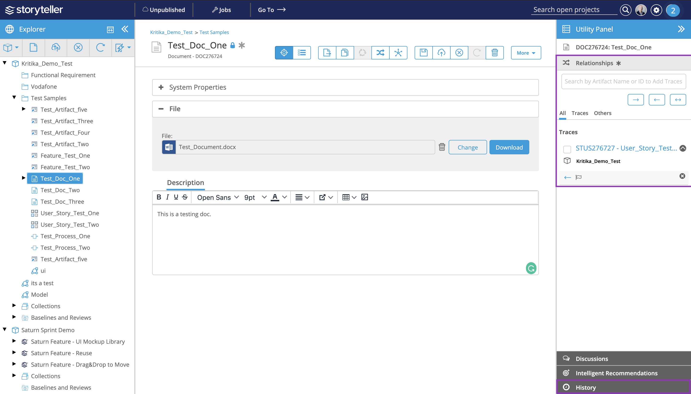
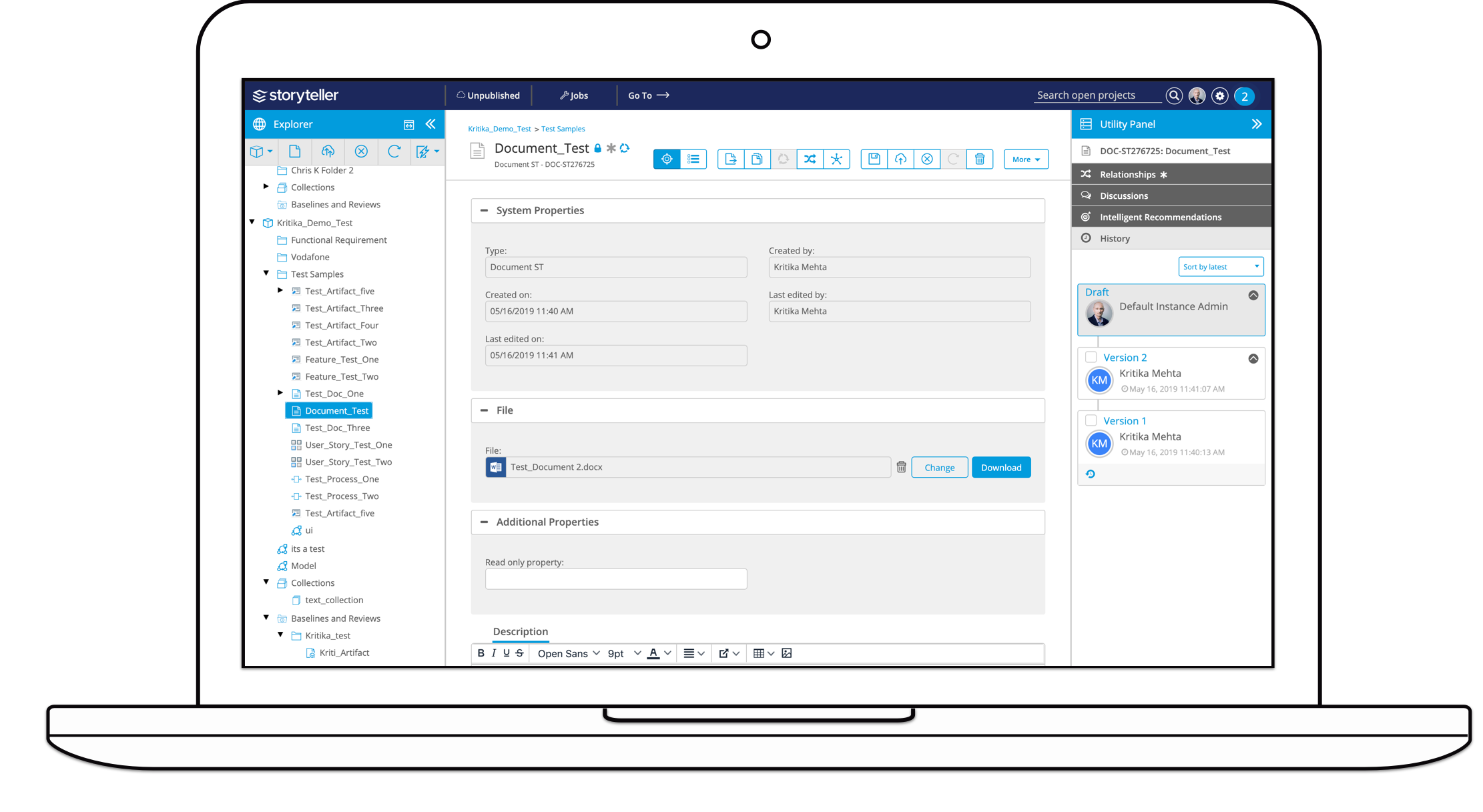
I was tasked to design the feature and collaborate with developers, UX researchers, and product managers to build a valuable feature that would part of the Storyteller Product in the 2019 release.

Problem:

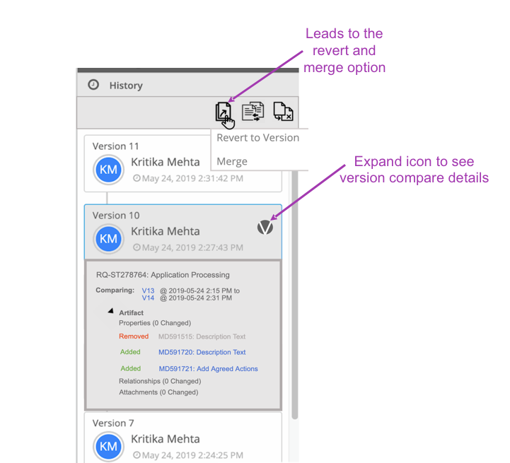
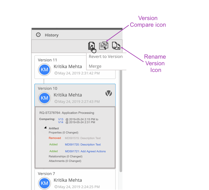
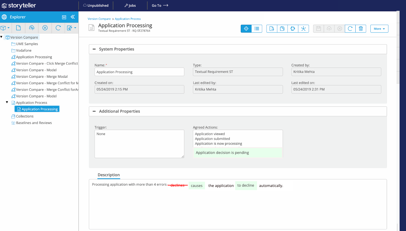
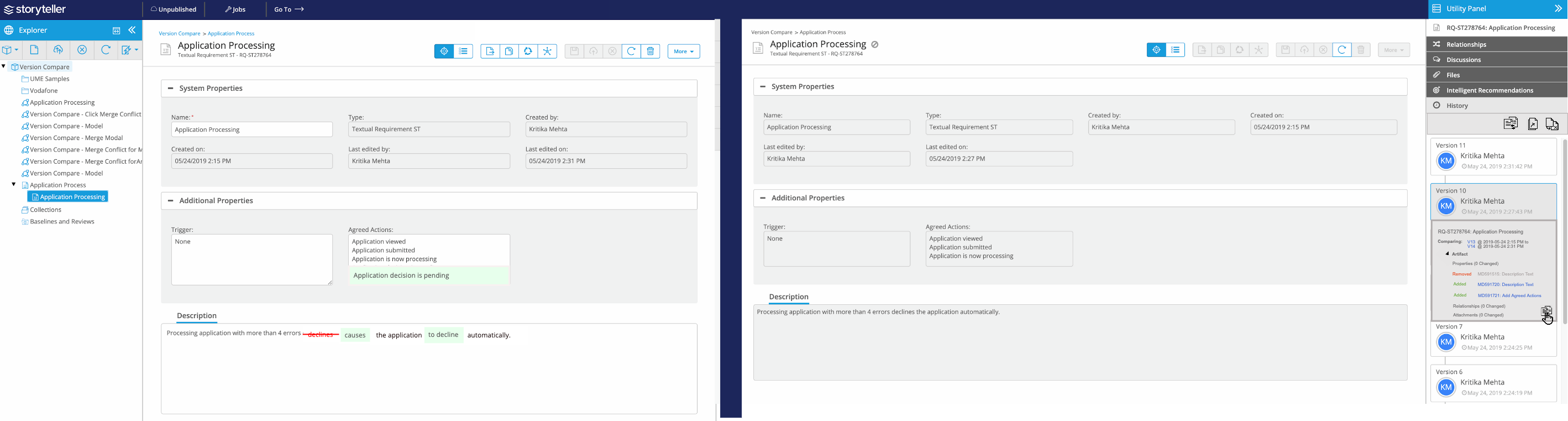
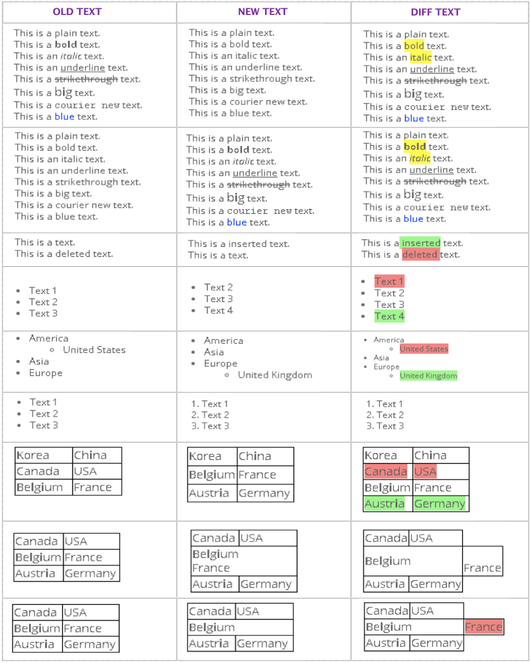
Implement the version compare feature into the Storyteller product as a minimum viable product.

Goals:

  • Design and develop a feature that is consistent with the Storyteller product
  • Design the version tracking feature considering all edge cases
  • Validate feature solution through usability testing

What is the Storyteller Product?
blueprint
Storyteller is a powerful requirements solution that allows users to collaboratively author, validate, and manage requirements for software projects. It also provides integration capabilities with other applications such as Jira. The application is designed for anyone who authors or works with requirements otherwise known as artifacts, including but not limited to: business and system analysts, architects, developers, quality assurance analysts, business stakeholders and customers.

As mentioned, an artifact refers to a requirement in the Storyteller product. The application supports a variety of base artifact types, including: textual requirements, use cases, UI mockups, business process diagrams, generic diagrams, storyboards, documents, and glossaries.

With more product insight, it was understood that version compare would be an essential feature as it will automate analysis instantly by visualizing changes between artifact versions.

Problem Statement:

Lack of artifact analysis to accurately highlight changes between versions.

My Role

At Blueprint Software Systems, I was given a lot of independence, so I got the opportunity to direct the vision of this feature in the given timeline. Some of my work included:

  • Conducting competitive analysis to prioritize and scope out minimum viable feature requirements
  • Seting the project vision using user research, design considerations, and, wireframes
  • Working with developers to scope feature cost, and reduce implementation time and budget
  • Making data-driven decisions using Pendo Analytics, Usertesting.com, Google Analytics, & in-person interviews

The Impact

The team is now beta testing the feature to better understand its usability and finishing up development on feature details.

The feature will impact many stakeholders in significantly reviewing changes between versions and adds to the Storyteller product line as a valued feature by customers.

Design Process

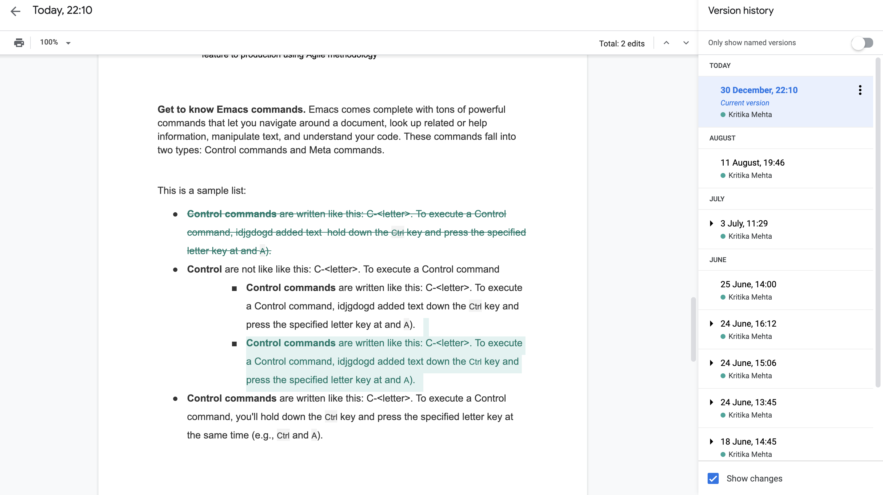
I started by looking at different products with the version compare feature to scope out requirements for the minimum viable feature that I wanted to design. I took some time to understand the Storyteller application to understand how the feature will fit into the application.

Competitive Analysis

Google Docs:

  • Revert to old versions easily
  • Lists number of changes
  • Inline and visual version comparsion
  • Can also rename or name unnamed versions


InVision:

  • Can select the History mode icon
  • No comparison between versions
  • Cannot restore old versions


Github:

  • Local/Individual & Centralized/Remote Workflow
  • Unified/Split View when merging two different versions
  • Green indicates added text, while red indicates removed text


Dropbox:

  • View individual versions without comparison
  • Can restore to an older version
  • Local/Individual Workflow


blueprint
Google Docs' Version Compare Feature


user

User Research


I conducted interviews with stakeholders to better understand their pain points. These interviews were conducted on customers that had requested for the version compare feature and were done via video calling. to better understand the operational perspective of the version compare feature. I also spoke with product managers and developers at work to avoid feature creep - the tendency for feature requirements to increase development work.


user

Feature Value

Through workflow analysis, I learned that stakeholders valued this feature as it:

  • streamlined artifact analysis accurately with changes visualized between versions
  • supported the audit process with ease to report on change as artifact changes would be easy to visualize.

user

Insights

From the user interviews, some common themes extracted include:

  • high-level comparsion between two previous versions of artifact were requested by stakeholders who are approvers or reviewers of artifacts
  • reverting to previous artifact state should result in the restoration of all values
  • users who don't want to restore all values prefer to select specific values or attributes from a previous version to restore.

The version compare feature was more than just the problem statement stated. The feature involved the ability to revert to a previous version and merge values of two different artifact versions

It was important to prioritize based on impact, development time, and budget.

Design Considerations

  • Entry point to feature will be the history card where all versions are displayed as seen in the initial UI which lacks the feature
  • Version compare feature will be designed side-by-side or inline
  • Feature add-ons will include revert and merge functionality


Proposed Design Solutions

I prioritized the design considerations and proposed a solution in an engineering and product team meeting.

The previous utility panel seen here had 4 new functionalities introduced in the history tab with the proposed design: revert, merge, rename, and, version compare.
blueprint blueprint
Utility Panel UI with Feature Icons

The version compare icon was the entry point to view the comparsion between two artifacts. For this, I had two design solutions ideated from user interviews - a single panel view and a side-by-side comparsion view.


blueprint
Version Compare Single Panel Design


blueprint
Side-by-side Version Compare Design


Solutions Explored

To better understand which design solution to go with, I explored the user experience and considered the risks associated with each design. Some users liked the inline version compare design, but some preferred to see both versions side-by-side. After various discussions with the product and engineering teams, I decided on the single panel design solution as it:
  • easily fit into the UI frame provided in the Storyteller application
  • required for less development work as the side-by-side view would result in more code change
  • and was consistent with the application I was building for, which was one of my initial goals.

Feature implementation

Once a design solution was selected, it was important to understand the work behind the feature. Front-end libraries were explored to ensure that the feature's functionality worked as promised to user.

Edge cases were important to consider as the Storyteller product allows users to create lists, tables, lists within tables, and other cases. It is essential to understand how version compare would work for all use cases in order to prioritize requirements for the minimum viable feature.

Considering these edge cases, the front-end developers and I decided to use DaisyDiff, a Java library in order to implement this feature into the Storyteller application. We analyzed how the DaisyDiff library performed under the various edge cases looking at the differences in text. The library perform well for the basic use cases such as understanding textual changes in lists, tables, and plain text. Despite having some bugs that didn't associate with the major use cases, the library was chosen as it went above and beyond by capturing style changes.
blueprint
Analysis of Edge Cases Using DaisyDiff Library


Iterative Design Process

Before breaking down the user requirements and technical user stories for the version compare feature, I analyzed the new user experience with quick mockups on Figma. Here I realized that the user experience could be kept consistent if existing components in the Storyteller application were reused.

Reusing components was important as it creates a consistent user experience.

The Relationships Tab consisted of the expand details arrow link and a checkbox for each relationship card which could be used for the History Tab version cards to implement the version compare functionality. Previously, the version cards had to be individually selected and had no checkboxes to indicate which two cards were selected for the version compare feature. Hence, reusing of Relation Tab components would decrease development time.


blueprint
Version Compare Single Panel Design


In addition to these design changes, workflow changes were required so that the user is able to select two version cards in order to perform version compare. This became a complex issue as checkboxes are a symbol of multiple selection but the version compare functionality would only occur if two version cards were selected.

Solution


Through iteration it was understood that the version compare feature would be more consistent with the whole application if it reused components found in other Utility Panel tabs such as the Relationship Tab. I explored several different solutions and workflows before coming up with a proposal. Inspired by the application Ritual which I used to order my lunch meals, I found a way to keep the application consistent with checkboxes while comparing two versions at a time.

Using Ritual almost every other day provided for a user experience that I found useful in building out the version compare feature. When I used to select my salad toppings, I realized that once I had exceeded the limit of toppings for the meal then the UI automatically deselected the first topping I chose. This user experience was suitable for the version compare feature as the user could select multiple versions but the version compare icon would only occur on the last two versions selected.


Selecting Salad Greens on the Ritual Application


The version compare feature became a solid feature using existing components and the slection concept discovered using the Ritual application. The selection concept was used to select version cards for comparsion. When two versions were selected then the History tab header would display icons. These icons included the version compare and merge feature. The revert icon was placed on the bottom left of all but the latest version, so that the user can easily revert to any version easily.


Version Compare Feature Demo with Revert and Merge


The final solution included the version compare modal which was built resuing artifact's user interface. As seen in the video, the modal for version comparison looks similar to the user interface behind the modal with comparsion shows in red and green. The merge functionality was labelled as 'Restore Select Values' which was another reused component from the Relationships tab. This modal highlighted key property changes and allowed the user to merge two different versions. The user is also provided with a summary of the merges in the 'Summary' tab of this modal. Essentially, this merge modal was easy to reuse as it captured essential values that users would look at when comparing two different versions.

One of the main features for this feature set was revert, which allowed the user to restore all values of a previous version. When writing out the user stories for this feature, I realized that all but the latest version could be used as a possible version that a user would like to restore. If there is only one version then reverting was not an option. To simplify the experience, reevert icons were in all but the latest version.

Additionally, use cases that were raised during user interviews were considered. For example, some stakeholders wanted a simple version comparsion between any version selected and its pervious version. To capture this use case, I made use of the version cards and the expand button in order to provide major details that highlighted changes between a version and its previous state. These major details included relationship, property, and files (attachments and documents) changes with count.

Learnings


Throughout this experience, I was able to work with various teams and learn many new things! This was my first expereince in the field of product management and a memorable one. I wore many different hates as I executed a feature from conception to development.

It was a very unique and different role than I was used to, so I had to learn a lot while executing an essential feature. There was a lot of focus on communicating with different teams like Sales, Marketing, Developers, and Product to ensure transparency and results. When I left this internship, the minimum viable feature was on beta and ready for testing and iteration.

In the end, this was one of my favourite internships as it provided a foundation to understanding the role of a product manager and the importance of product scoping, prioritization, and execution.